4 Steps to Success: A Conversion Rate Optimization Checklist for 2022
Conversion Optimization 11 min read
Conversion Optimization Digital Marketing
Don’t think much about your web design colors?
In digital marketing, color psychology isn’t a new conversation. In fact, it’s a concept brand marketers are all too familiar with. But did you know you can also use it to drive online conversions across your marketing channels?
As a web development agency that loves to experiment with colors, we’ll let you in on the secret of what color psychology is, why we value it, and how we use it to increase your website conversions.
Color psychology is the study of how colors, hues, and shades influence one’s emotions, behavior, and reactions.
It analyzes the symbolic meaning behind colors and their responses to our brain chemistry, hormones, and overall physiology. It also explores how different colors are associated with certain moods and states of mind.
People who use bright colors would usually suggest their bright personalities. Or, the color blue suggests a calming or relaxed vibe for people. These associations can be universal, but they can also be cultural in some contexts.
Multiple cultural studies prove that color perception differs greatly between cultures and in certain contexts. Understanding how these perceptions vary can help designers create better websites that appeal to a broader range of audiences.
For example, the color blue often symbolizes feelings of trustworthiness and security in Western countries, whereas, in some eastern countries, it is associated more with sadness or death. Another one is that in Chinese culture, the color red symbolizes good luck and joy, while in western cultures it might represent anger or passion.
Other than that, a good web designer should consider factors such as age group and gender when selecting website colors as it may evoke different reactions from specific groups of people.
Understanding the subtle nuances of color psychology is essential to achieve maximum conversions on your website.
Colors evoke strong emotions in all of us. In fact, the Propelrr Digital Marketing Strategy Framework shows that your brand’s color is an important part of building an effective and memorable brand that reflects everything that your business stands for. They must also resonate well with your target customers.
By understanding color psychology, businesses can use it to create a desired look, feel, and overall vibe for their website. Additionally, they can use it to evoke a positive response and incite action from visitors to improve website conversions.
Color psychology is vital to communicating value and influencing your subconscious marketing strategies. Through a good understanding of this neuromarketing technique, you can instigate reactions or, more importantly, actions from audiences toward your campaigns.
On top of that, here are some ways color psychology benefits your marketing campaigns:
ADDITIONAL RESOURCE: List of Best A/B Testing Tools for Conversion Optimization Pros
READ MORE: Web Design and Marketing: 7 Reasons They’re Related
If you want to achieve a certain reaction from your target market, then color is the way to do it.
The best guide to choosing website design colors is the color wheel.
Each color in the color wheel represents a meaning or emotion. To best leverage color conversion psychology, you must take into account nuances in your niche that might change the meaning of these colors.
For example, a color psychology study suggests that men and women generally prefer the color blue. On the other hand, some behavioral studies show that women prefer shades of pink rather than blue.
Still, the same argument stands: color preferences can affect marketing and your understanding of your audience should still influence your choices for color usage.
To start, you can first experiment with the most popular colors and their widely-associated meanings. We outlined some of these colors and how you can use them for your brand.
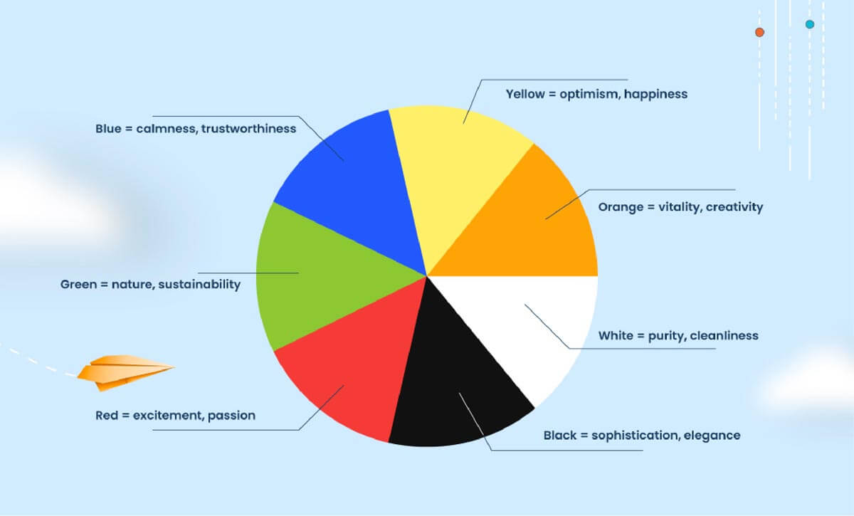
Color Wheel in Color Psychology. On top of considering the brand’s pantone guidelines, you should also take into consideration color psychology in your design project. Choose colors that not only match the brand’s guidelines, but also colors that are complementary, both in an aesthetic manner, and based on these psychological cues suggested in color psychology. Photo by Propelrr.
Here is the truth you must face: Color conversion psychology doesn’t always work on the first attempt. The colors you choose might be carefully considered but they can fail to resonate with your target audience for so many reasons.
The best way to avoid this is to follow some of the best practices in color psychology. Take note of these actions to ensure that your colors and marketing efforts work for your brand.
Your colors might be great or they are in harmony with each other, but these colors should have a purpose. As an example, which color would best help your users read the text on a blue background? Should it be black-colored or white-colored text?
Visually appealing designs should be easy on your viewers’ eyes.
EXPLORE: Tips for Designing Better Visual Content for Social Media.
Use contrasting colors that create enough contrast between the background and foreground elements and be strict with color accessibility standards such as Web Content Accessibility Guidelines to ensure designs are accessible regardless of any visual impairments.
General colors are fine, but you can add more colors to create a better color scheme that would result in a brand color that speaks to your audience.
Utilizing subtle changes in hue and saturation will keep things looking clean while also allowing you to make use of different tints and shades for added emphasis where needed. In this part, you would need to seek expert advice so that you are assured that you’ve picked complementary colors.
Colors can also be used to guide users through websites in an intuitive way by focusing on prominent signifiers like call-to-action buttons or product images. Here are several ways how website colors can do that:
By using colors strategically to guide user flow on a website, businesses have the opportunity to create an intuitive experience that supports conversion goals.
Overall, these trends in web design colors are geared towards creating experiences for users that emphasize balance and harmony over loudness or clash.
For example, let’s say you want to test whether using a blue button instead of a green button will increase your click-through rate. To do this, you would create two versions of your web page – one with a green button and one with a blue button – and then track how many people click on each button. If more people click on the blue button, then you can conclude that blue is a more effective color for your button.
By changing one element at a time, you can isolate the effect that each change has on your conversion rate.
You can use this in a number of elements on your web page, including the color of your call-to-action buttons, the background color of your site, or the color of your opt-in forms. By testing different elements, you can isolate the effect that each change has on your conversion rate.
Color conversion psychology is an effective way to drive conversion rates for your brand. But first, you must remember a few things to ensure its effectiveness.
Ready to mix colors and marketing for better conversion rates? Or are you still unsure of how to use it effectively? If that’s the case, we’re just a ring away, ready to help you out. Just send us a note through our Facebook, X, or LinkedIn accounts.
Want to get insider tips on how to diversify your marketing strategies? Subscribe to our newsletter and we’ll deliver it straight to your inbox.
